Creating new types of Controls (Advanced)
Introduction
QuartzIQ enables you to customize Item Models and Workflows, allowing you to create new types of Controls tailored to your organization's needs. This flexibility lets you thoroughly document your internal controls and precisely define each type of Control being performed.
To create new types of Controls, you must have the qx-admin user role set for your user.
Creating new types of Controls
You can create new types of Controls by going to the Application Settings portal, where you will be able to customize Item Models and Workflows.
Custom Control types will be based on Manual Controls that are non recurring (they don't generate any tasks). For more information on Control Types, you can view the Control Activities article.
In order to access this portal, you can use the Application Settings section in the side menu, in QuartzIQ.
You will be redirected to the Application Settings portal (Admin), where you will be able to select the Data Models > Item Models section.
In this section, you will be presented with all the Data Models of QuartzIQ. In our case, we only want to create a new type of Control. In order to do this, you can select the Create Item Model button.
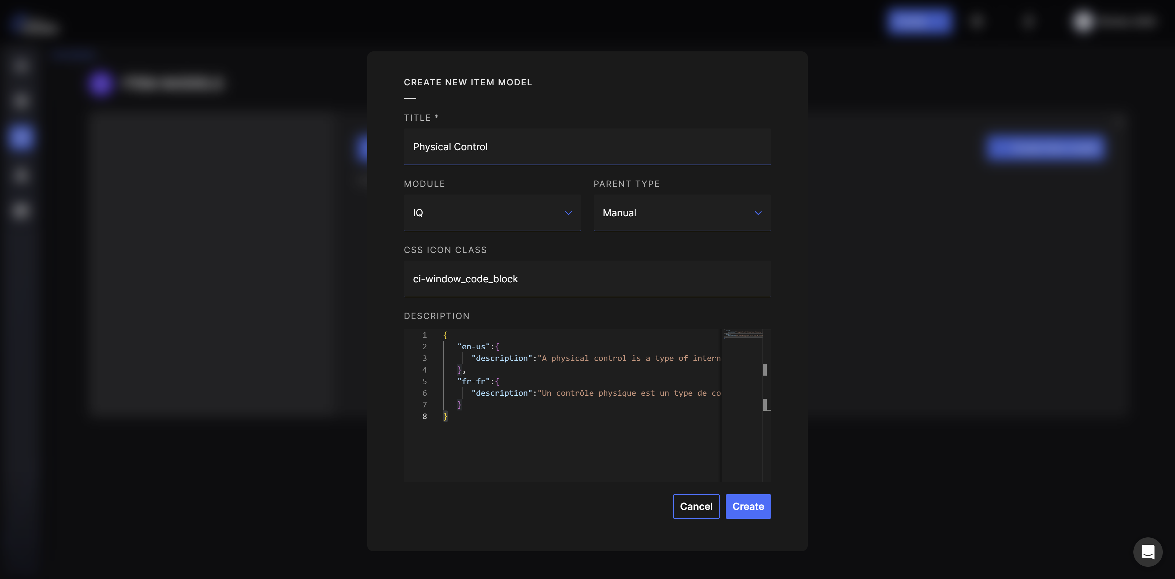
You will then be prompted with a screen allowing you to input different information:
- Title: this will be the title showed to your users in QuartzIQ.
- Module and Parent Type: this allows you to specify which Item Model you want to create. In our case, we want to select the IQ module and the Manual Parent Type.
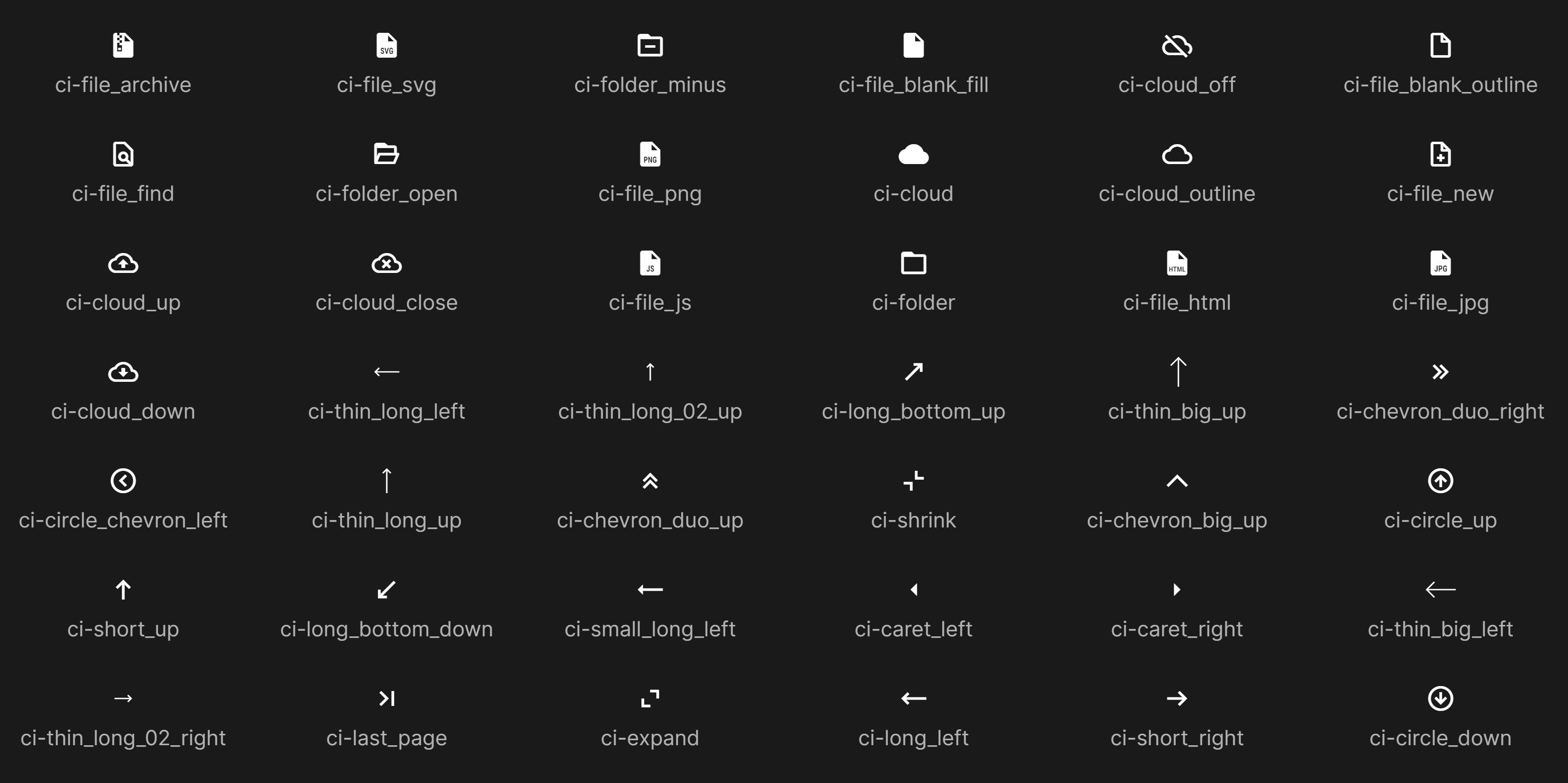
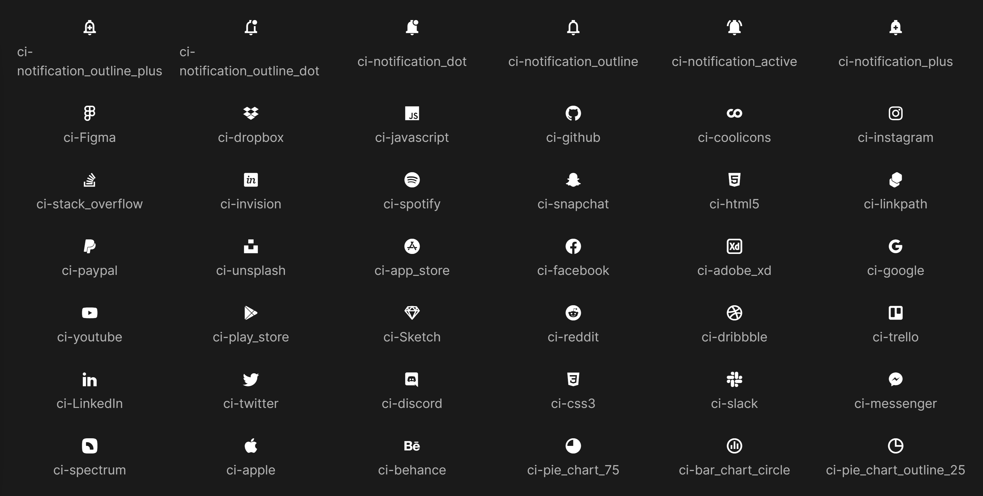
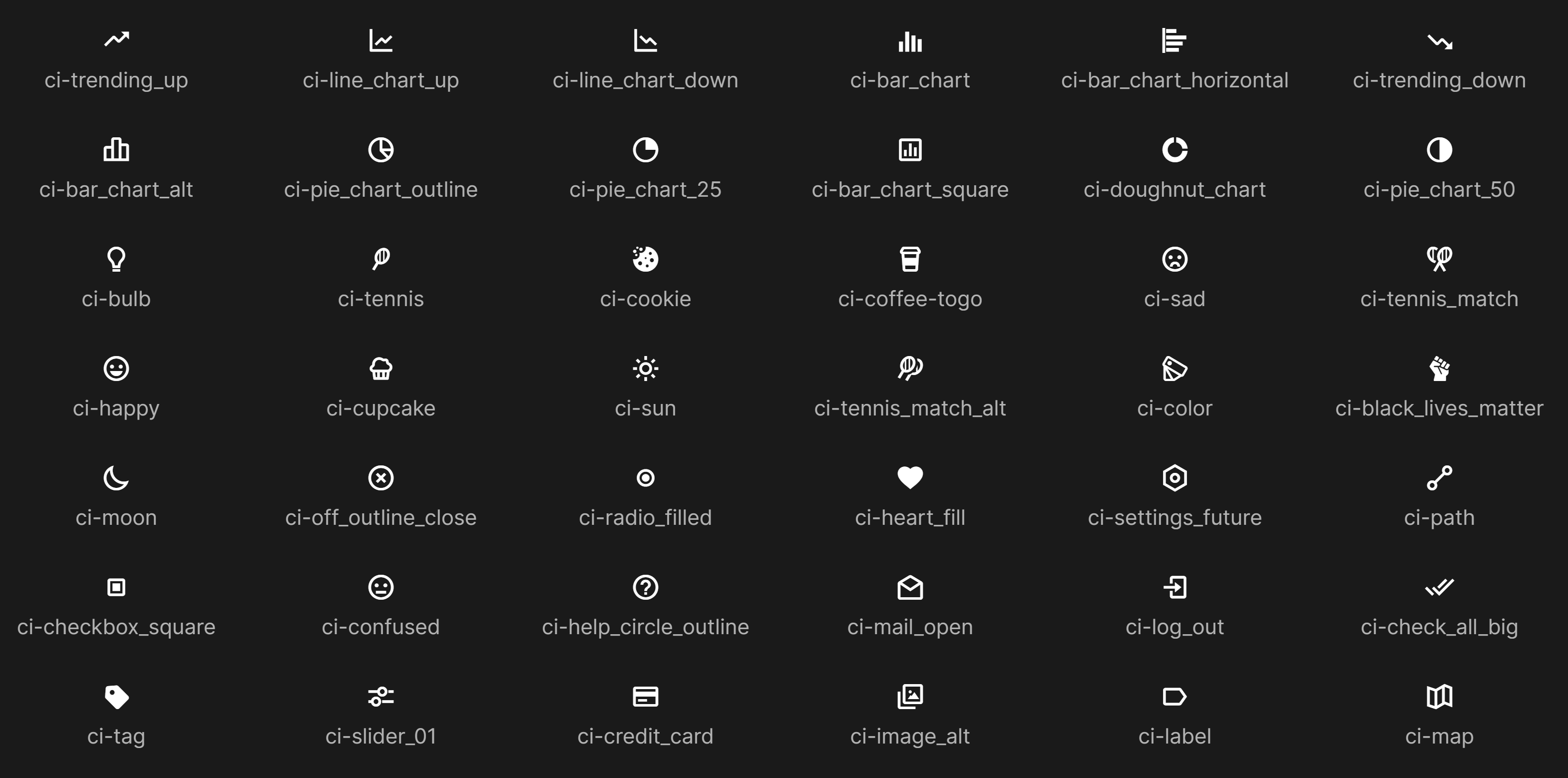
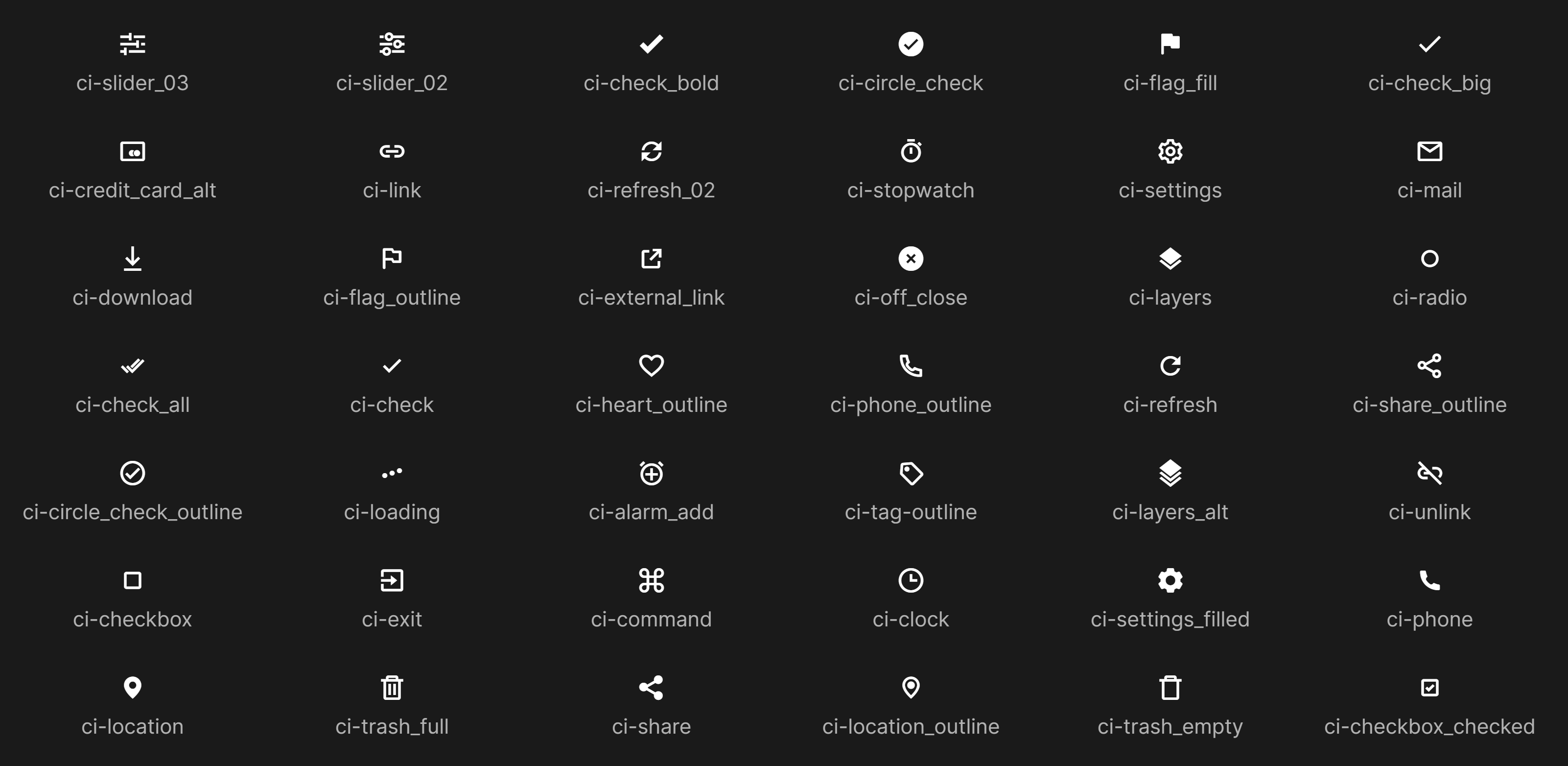
- CSS Icon Class: this allows you to customize the logo that will be displayed to users. A table is provided below.
- Description: this allows you to configure a description that will be shown to your users upon creating a new Control. We recommend configuring one but it is not mandatory. The description should be in a JSON format. An example is provided below.
{
   "en-us":{
      "description": "A physical control is a type of internal control designed to safeguard physical assets and ensure they are used only for authorized purposes."
   },
   "fr-fr":{
      "description": "Un contrôle physique est un type de contrôle interne conçu pour protéger les actifs physiques et garantir qu'ils sont utilisés uniquement à des fins autorisées."
   }
}
After clicking Create, you will be redirected to the new Control Type page where you can edit its information, but also define new fields you want to store on the Controls.
You can now add new fields by clicking the Add Field button where you will be asked this information:
- Name: the name of the field you want to add. This will be showed to users.
- Order: this allows you to define an order of display for your fields.
- Field Type:
- String: this is a text field.
- Integer: this is an integer number field.
- Float: this is a decimal number field.
- Datetime: this is a date and time field.
- Boolean: this is a True or False field.
- Lookup: this allows you to specify a dropdown list.
- Employee: this allows you to add an employee field. An employee is any user configured in your organization.
- Is Visible: this allows you to define if you want the field to be visible or not. It can be used if you want to decommission a field but still want to keep the data (to reuse it in the future).
- Is Filterable and Is Searchable: this allows you to add a filter on this field in the search section of the Controls in QuartzIQ.
Using the new type of Control
After creating the new type of Control, you will be able to create a Control using this type directly in QuartzIQ.
In order to proceed with this, you can either create a new control from the top bar Create button (Create Control Activity) or by navigating to the Perimeter of your choice, viewing the Controls tab and using the Create Control button.
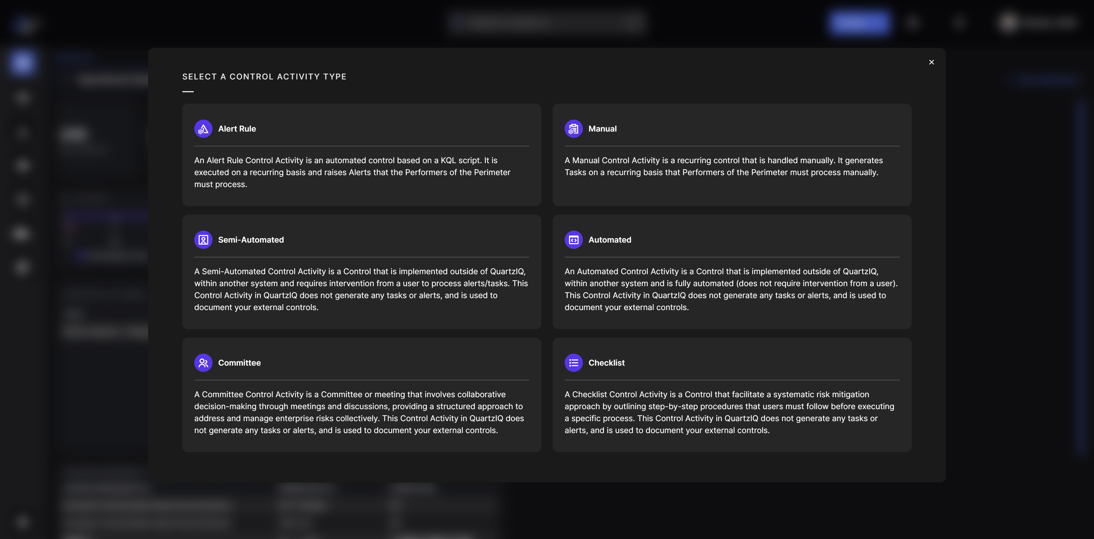
You will then be prompted with a selection of the Control type you want to use, and you should find your new Control type in this list.
CSS Icon Class Table
Below are the available CSS Icon classes you can use to customize the icon of your new Control type:
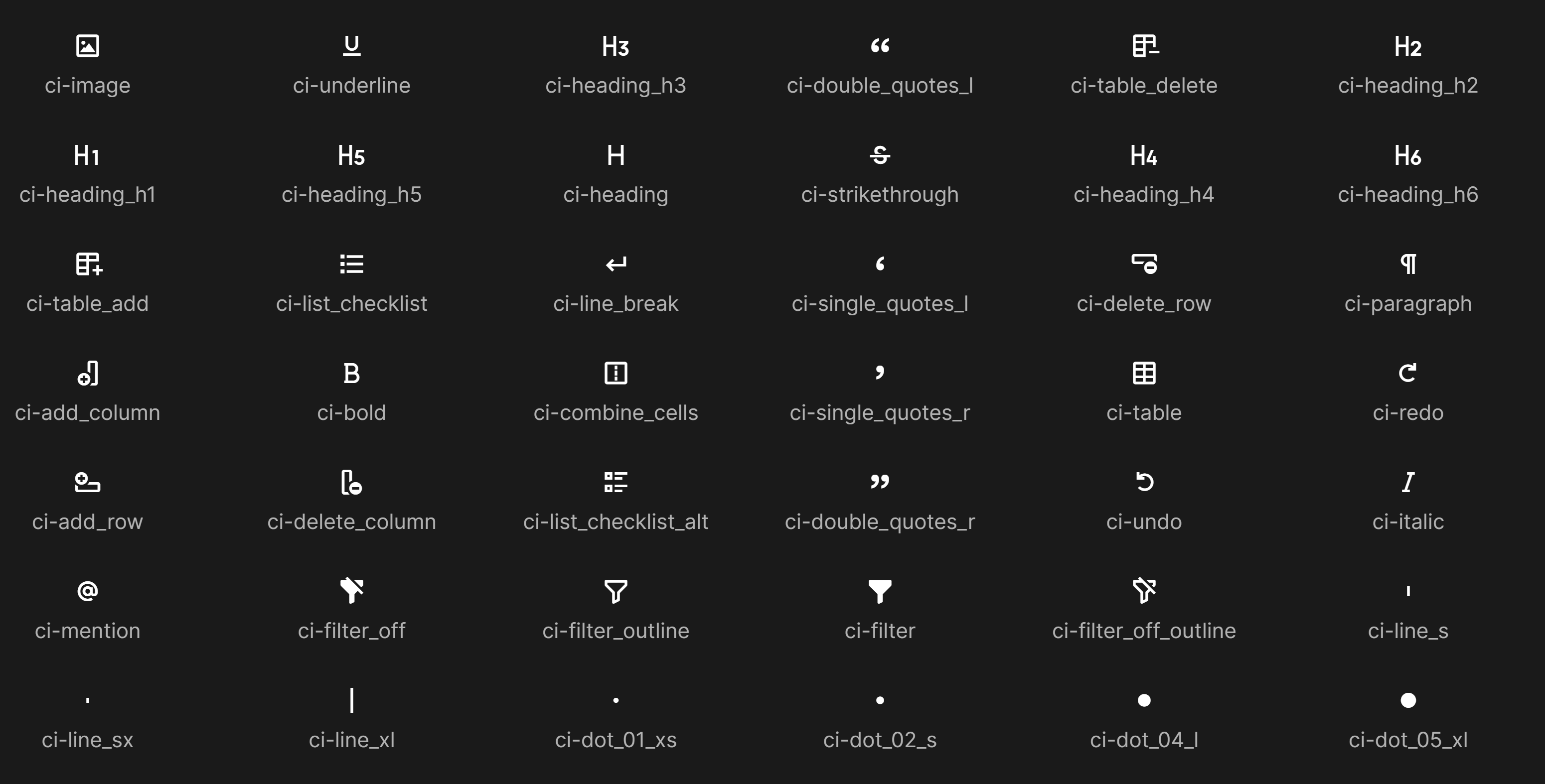
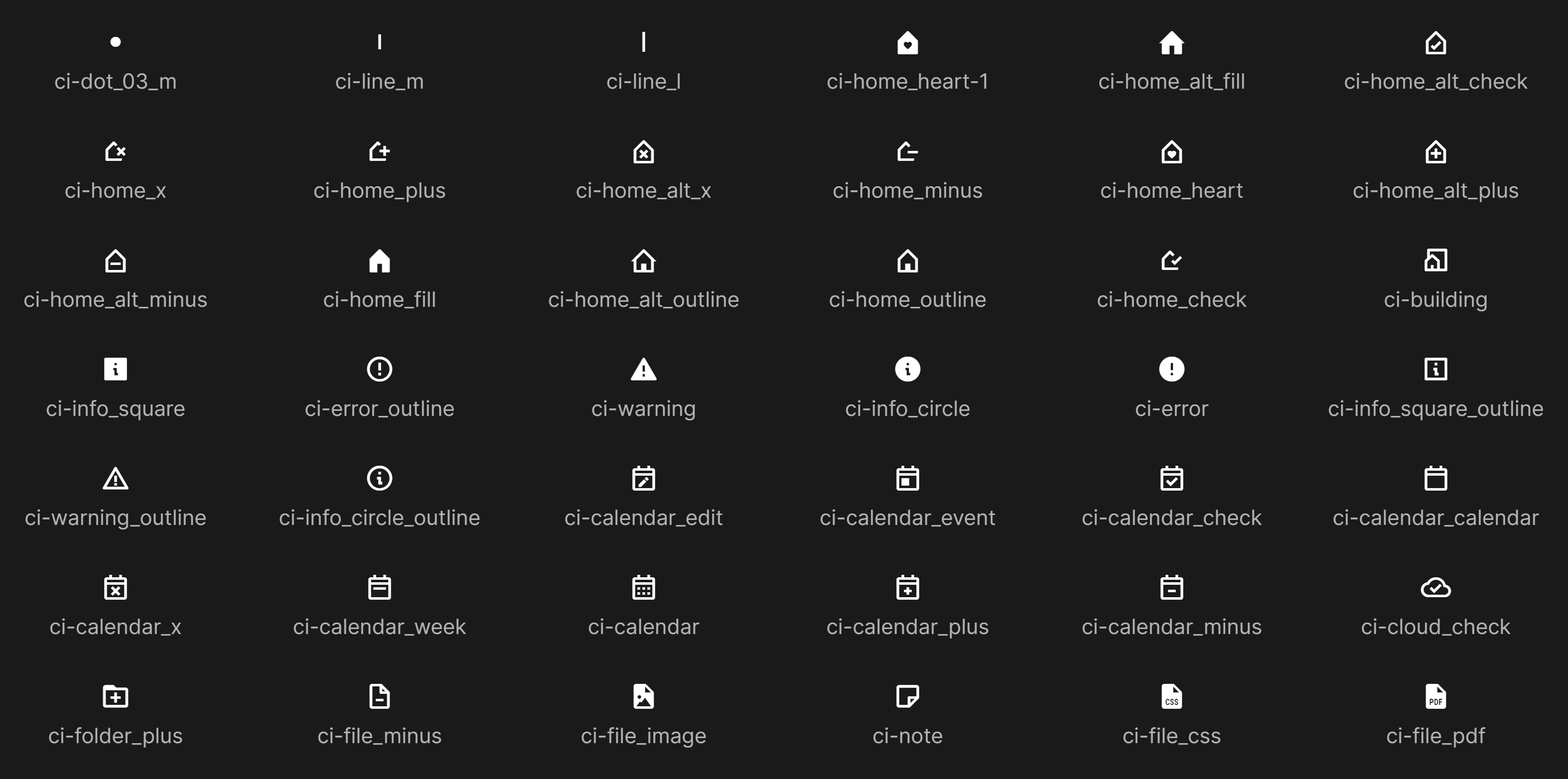